With a great coffee package design, you can increase brand recognition and stand out from the competition, which will help you draw in new clients and keep hold of old ones.
However, the best coffee packaging accomplishes much more than simply drawing in customers. It should safeguard your coffee while it travels from the roasting facility to the customer’s hand and preserves the freshness and quality of the beans for as long as feasible.
And when they are accomplished, adequate coffee packaging successfully accomplishes its primary goal of providing customers with a product they enjoy and can rely on. Additionally, you’ll want to achieve these goals in a sustainable, appealing, yet educational manner.
In this blog, We’ve compiled seven of the most excellent techniques to make your coffee packaging design extraordinary to get you started.
7 best packaging for Coffee Design Online (strategies) That Sells Itself
To attract new customers, coffee packaging design services are crucial. The trip begins with enjoying the package design, but a pleasant experience can impact subsequent purchases and foster ongoing brand loyalty.
Whether you run a coffee brand or seek branding inspiration, you’ve arrived at the ideal location. We rounded up the 7 best coffee packaging design tips for 2023. Let’s look at them.

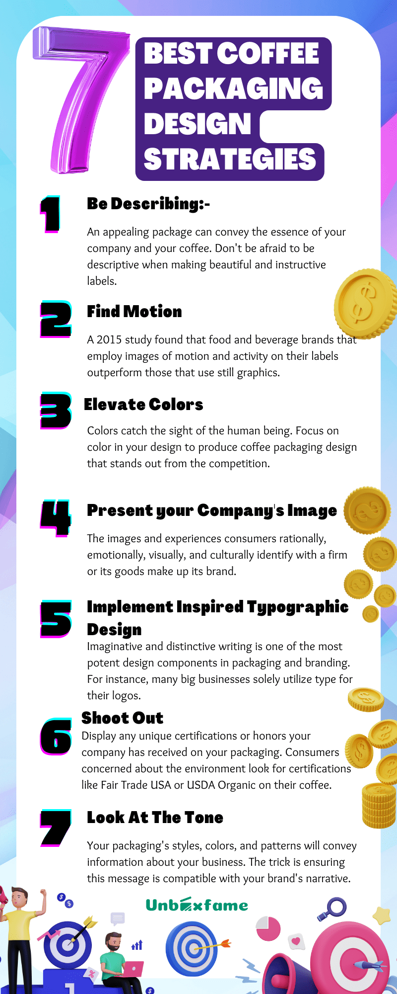
1. Be Describing:-
An appealing package can convey the essence of your company and your coffee. Don’t be afraid to be descriptive when making beautiful and instructive labels. Consider any intriguing trivia that customers might like learning. Include any pertinent advice or instructions for brewing the ideal cup of coffee, as well as relevant details about the origin and processing of your unique coffee packaging design. List the flavors a customer might anticipate tasting in your coffee, such as fruit undertones or chocolate flavors.
Avoid overcrowding your label; use text blocks and inventive font to break up long text passages and, when appropriate, styled graphics to help convey your point more clearly.
2. Find Motion:-
Use animated graphics to make distinctive and eye-catching the best and beautiful coffee packaging designs.
A 2015 study found that food and beverage brands that employ images of motion and activity on their labels outperform those that use still graphics. Customers are more inclined to choose motion-forward packaging on a store shelf because they think “moving” labels are more intriguing and recent than others.
Consider an illustration or photo of your coffee being poured into a waiting mug or of beans overflowing into cupped hands if you want to include one on your packaging. The viewer will be drawn to your product by the movement, providing them with a sensory experience and encouraging them to read more.
3. Elevate Colors:-
Colors catch the sight of the human being. Focus on color in your design to produce coffee packaging design that stands out from the competition.
Color psychology can create eye-catching labels; for example, gold transmits elegance and regal qualities, while green is frequently connected to health and nature. You may use a variety of hues to create a lively design that mimics the tones of a tropical rainforest.
To make your product stand out, you don’t necessarily need to utilize bright colors in the packaging. Sometimes vibrant labels look just as stunning as minimalist ones, and they can communicate your company’s chic, cool, and contemporary nature.
Try out a couple of alternative color schemes. You might experiment with unique colors like spring green or blush pink to make your package stand out. You might also use a muted color scheme of calming greys or browns. The message and tone of your business is an effective color scheme that stands out from the competition.
4. Present your Company’s Image:-
The images and experiences consumers rationally, emotionally, visually, and culturally identify with a firm or its goods make up its brand. We readily link particular logos, catchphrases, hues, and scents to specific businesses.
Having your brand on your coffee packaging design is crucial as your business grows. You don’t have to put your brand in the center of the label if you’d instead let the coffee speak for itself; you could instead place it high or low on the package or keep it off to the side of the main label.
Maintain a unified brand identity across all your coffee products; this will make your company more recognizable to customers and help them recognize the various coffee products you sell in-store.
5. Implement Inspired Typographic Design:-
Your packaging’s typography has a significant role in determining its success.
Imaginative and distinctive writing is one of the most potent design components in packaging and branding. For instance, many big businesses solely utilize type for their logos, demonstrating the impact of superb typography.
Consider keeping your brand’s typography uniform and complementing across all of your coffee packaging. Keep the tone consistent on your coffee packaging if your company employs minimalist typography for branding. You can experiment with a few different sizes and styles, but consistency will strengthen your brand overall.
Contrasting typography may be powerful when used correctly. You might utilize a robust and vintage-inspired typeface on your coffee packaging design label if your brand uses modest, minimalist text to add drama and emphasis. Use caution when using numerous lettering variations on packaging since too many will make the label look cluttered and unpleasant.
6. Shoot Out:-
Display any unique certifications or honors your company has received on your packaging.
Consumers concerned about the environment look for certifications like Fair Trade USA or USDA Organic on their coffee. The Smithsonian Migratory Bird Centre and the Rainforest Alliance are two different organizations that endorse eco-friendly coffee. Before displaying your product on your packaging, confirm that it has received the certification from the certifying organization; your supplier must complete this step.
Even if your brand lacks major certifications or honors, you can still boast on your label. Emphasize your brand’s ideals, such as pesticide-free farming or supply chain openness. Telling the buyer your business is committed to producing high-quality goods will help build their trust in your offering.
7. Look At The Tone:-
Consider your brand’s tone as you are looking to create a beautiful coffee packaging design.
Your packaging’s styles, colors, and patterns will convey information about your business. The trick is ensuring this message is compatible with your brand’s narrative. For example, are you trying to bring an old-fashioned atmosphere by emphasizing the coffee’s historical roots, or do you like the trendy downtown air of a large city coffee shop?
Many of your packaging decisions, from color selection to finishing materials, should be influenced by the tone of your brand. A matte finish may feel contemporary and organic, whereas a gloss coating may be associated with refinement. The finishing material will also alter the overall tone of the packaging.
Select Unboxfame as Your Exclusive Packaging Partner
A crucial step is picking the top coffee packet design company from the design coffee packaging services.
At Unboxfame, we are committed to forging enduring connections with our customers and creating the best possible packaging and goods. With the help of our specialized packaging services, your business may use packaging to tell your brand’s story.
Don’t accept poor packaging. To discover more about original and creative packaging, get in touch with Unboxfame right away.
In publishing and graphic design, Lorem ipsum is a placeholder text commonly used to demonstrate the visual form of a document or a typeface without relying on meaningful content.
