In the evolving digital ecosystem, smartphones stand as an extension of our lives, the significance of mobile optimization and responsive design cannot be overemphasized. Still, there are instances of poor mobile optimization and if you are one of those, you probably are missing out a lot if you still haven’t transformed your website into a responsive one. And as we say, it’s never too late, so let’s delve into the world of responsive web design and take a look at its role in the success of any business.
What is mobile optimization and responsive web design?
Many of us often get confused between mobile optimization and responsive web design concepts. We also wonder about the relation between both concepts. It is not much of a deal, both are different ways of reaching the same goal, that is, improving a website’s performance on mobile devices. Mobile optimization prioritizes enhancing performance and user experience specifically for mobile users, whereas responsive web design is geared towards creating a flexible layout that maintains a consistent experience across various devices.
The Mobile-Centric Era
As we all know, the global web traffic through mobile devices is rising day by day and has reached a significant height in 2024. Therefore, it’s high time that you optimize your website for mobile phones. This will not only take you a step ahead but will also make you visible to a substantial group of your audience.
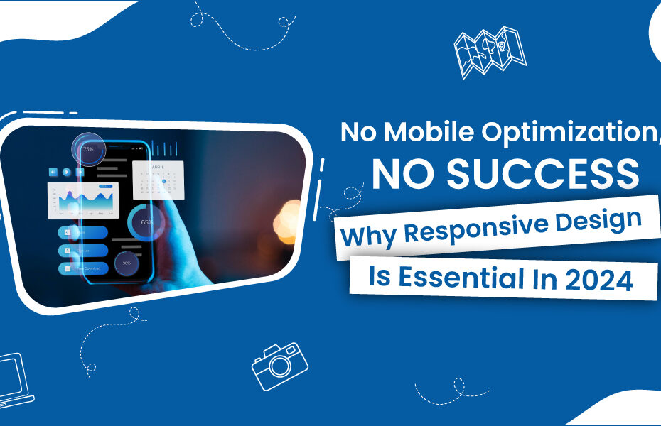
When was the last time you went through your website on a mobile phone? Go ahead and take a look!
User Experience Matters
Responsive design just not only elevates looks; it creates a smooth user experience. It helps you in the enhancement of user engagement on your website by allowing your website to adjust to various screen sizes and orientations. Who likes to work on a website that does not function properly on a mobile phone? The answer is no one. A visitor will always prefer a website that provides a seamless experience rather than one that needs to be zoomed in every then and now.
Why Is IT Essential?
• Lower Bounce Rates: An optimized website engages a visitor for a longer period.
• Higher Conversion Rates: And, if a visitor stays longer on your side, the probability of interaction rises.
• Improved SEO: Website ranking by Google also depends a lot on responsive design, as Google favors sites that are mobile-friendly.
The Impact of Google and SEO on Online Visibility
As we talk about SEO, Google’s indexing and ranking of sites is predominantly based on mobile versions of the websites. Hence, if your site is not responsive, you are risking getting lost in the ocean of online content.
Here Are Some SEO tips- Friendly Responsive Design:
• Optimize Images: Use flexible images that scale appropriately.
• Streamline Navigation: Ensure that menus are easy to access and use on small screens.
• Minimize Loading Times: Mobile users expect fast loading; aim for under three seconds.
Which of the following aspects would you consider as most challenging while optimizing your site? (A) Image optimization, (B) Navigation, (C) Loading times, (D) All of the above
Increasing Brand Reliability
We are in an era where consumers have innumerable choices, so having a well-optimized and visually appealing site induces a sense of trust and reliability among the audience, making you stand apart from the others. On the contrary, a poorly designed site can take a toll on your reputation and drive potential customers away.
Enhancing Trust Through Visual Design:
• Consistent Branding: Ensure your branding is consistent across all devices.
• Professional Aesthetic: Use high-quality visuals and a clean layout.
• Clear Call-to-Actions: Make it easy for users to know what to do next.
Imagine you are a customer given a choice between two brands to purchase from. One’s website is seamlessly designed while the other one’s is poorly designed. Which one of them will you go for in the first look?
The Current Landscape: Advancements in Technology
As We Approach the Future, innovative technologies are making waves, for example, augmented reality (AR) and progressive web apps (PWAs). A solid foundation of responsive design is required to ensure the smooth functioning of these innovations across devices.
Why Embrace Change?
• Stay Competitive: All your competitors are looking for an upper hand, and mobile optimization is one of them.
• Meet Consumer Expectations: Consumers expect a well-designed website and a seamless experience.
• Prepare for Future Trends: Transformation through responsive design will set you forward in the realm of technological innovations.
Hold on for a moment and think about how the emerging innovative technologies could strengthen your business.
Conclusion: Build for Tomorrow
In 2024, responsive design has become essential rather than optional. With the increasing prevalence of mobile usage, businesses must adapt accordingly. By focusing on mobile optimization, you’re not only improving the user experience but also securing the future of your brand.
Now is the time to realign your approach, if you still haven’t optimized your site for mobile devices yet. Start with small changes and keep on building.
Let’s collectively adapt to the mobile revolution.

In publishing and graphic design, Lorem ipsum is a placeholder text commonly used to demonstrate the visual form of a document or a typeface without relying on meaningful content.